What’s changed, what hasn’t – And what’s worth knowing now

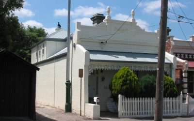
Do you own a heritage home? Congratulations! You own a piece of Australian history – preserved in time. Perhaps the council has actually designated it as such because of its historical significance, architectural uniqueness, or because it contributes to the understanding of the area’s history. Or maybe it’s just a heritage home in reality or in your own mind – it really doesn’t matter. The only thing you need to know is that heritage homes absolutely rule, telling their individual stories of times past and standing in all their historic glory.

Colour. In the scheme of things, it might seem pretty surface-level. But it’s actually one of the most consequential decisions a heritage homeowner can possibly make. We’ve written about it before, and the response we got told us that people genuinely care about getting it exactly right for their much-loved home. Heritage house colours Australia wide really does remain a topic that generates more questions than almost anything else in the period home space – and for good reason. Because the wrong choice doesn’t just look off, it can totally undermine the entire character of a home that’s spent a century earning its personality.

And that applies not only to exterior heritage house colours, but to internal colours too. The right heritage paint colours should respect your property’s historical significance, bring out its architectural detail and beauty, and superpower its inherent charm.

Since we last covered this, a few fairly major things have changed:

  • Colour technology has improved.
  • Paint manufacturers have invested more seriously in historically accurate palettes.
  • There’s been a quiet but noticeable evolution in how heritage homeowners think about colour.

What evolution, you’re wondering? Well, heritage homeowners – just like you – have become less rigid in terms of sticking with the exact original colour palette of their home. At the same time, they’ve become vastly more informed in terms of how to accurately interpret period authenticity.

So even if you think you already know it all about heritage house colours in Australia, this one’s well worth a good read…

Before you choose a colour: The principles that haven’t changed

Getting heritage colours just right starts with understanding the architecture in front of you, not just reaching for a ‘safe’ palette.

  • Here’s what’s really important:
  • The era of your home
  • The building materials that were used
  • The proportion of decorative detail
  • Any local council heritage guidelines.

Together, they all shape what’s appropriate – and what will look jarring against both the property and its streetscape.

This is especially important when considering heritage house colours Melbourne wide, where many homes sit within established streetscapes and heritage overlay areas. Council heritage overlays can restrict colour choice in some areas – particularly for properties with a formal heritage designation. So always check before committing to anything that strays significantly from the existing palette.

Most heritage homes operate on a three-colour system:

  1. A dominant field colour for the main walls
  2. A secondary colour for the trim and architectural detail
  3. An accent colour used sparingly on features like the fretwork, balustrades, and window surrounds.

Getting this hierarchy right matters as much as the specific colours chosen within it.

Now let’s dive a little deeper:

Heritage house colours exterior Australia – The 8 worth knowing

These are our hand-picked 8 – a mix of the classics that have stood the test of time and a couple of more recent additions that reflect how heritage colour thinking has evolved.

For each one, we’ve noted what’s changed as well as what remains as true as it ever was:

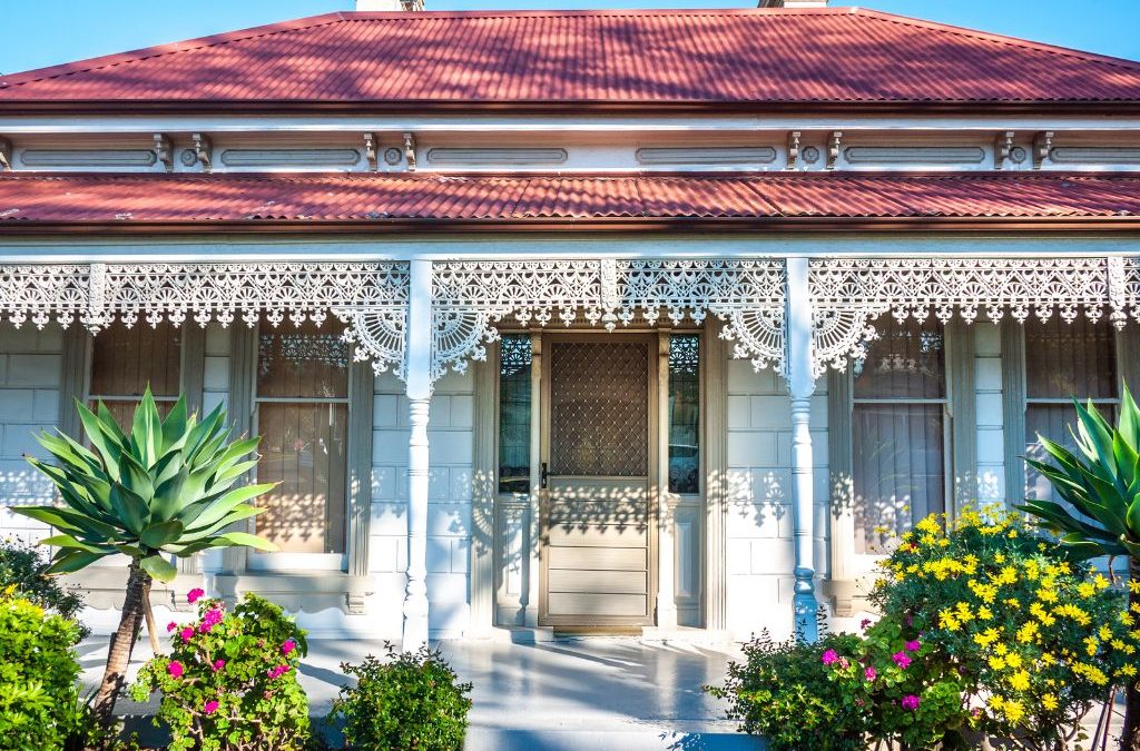
1. Federation red

Still our favourite and still one of the most striking choices for homes from the Federation era.

This deep, earthy red draws out the intricate woodwork and stonework that defines Federation architecture and carries an authenticity that’s hard to replicate with any other colour. Paired with cream or off-white trim, it commands a streetscape without overpowering it.

What’s Changed?: The range of Federation reds available has broadened considerably, with more nuanced brownish and terracotta-leaning variants now available that suit homes where a pure red reads as too bold.

2. Heritage green

A perennial for Victorian and Edwardian homes – particularly for:

  • Trim
  • Window frames
  • Decorative elements.

Heritage green sits naturally against the muted field colours typical of the era and has the kind of depth that flat modern greens lack. The recent shift in broader design toward botanical and earthy tones has made heritage green feel more current without it needing to change at all. It works on exteriors and, used carefully, brings real character to period interiors too.

3. Classic cream

Versatile across almost every heritage home type and era. Cream does what white often can’t – it softens without flattening, and lets decorative detail read clearly without competing with it.

On larger wall surfaces it provides a warm, historically grounded base that accepts almost any trim colour.

Your House Extension Specialists

If you're planning a house extension or renovation, RFT Solutions extension designers offer peace of mind. Our goal is to save you time, money and achieve a result you love.

Worth Noting: There’s significant variation within ‘cream’ across different manufacturers’ heritage ranges. Undertones matter – a cream with a green or grey undertone reads very differently to one with a yellow or pink base. So, sample on the actual surface before committing.

4. Sandstone yellow

Drawn from the natural sandstone used extensively in older Australian homes – particularly in Victoria, South Australia, and in and around Melbourne’s older suburbs – this warm, earthy yellow complements timber and stone accents in a way that feels genuinely period-appropriate.

It’s particularly effective on homes with rendered facades, where the colour references the original material even when the material itself isn’t visible.

On exterior heritage house colours, sandstone yellow has seen something of a resurgence as homeowners move away from the grey-dominant palettes that took over residential exteriors for the better part of a decade.

5. Victorian blue

Best used as an accent rather than a field colour – meaning it should be reserved for the decorative elements that define Victorian architecture:

  • Cornices
  • Balustrades
  • Window surrounds
  • Fretwork.

Victorian blue against a more subdued main colour creates exactly the kind of visual punctuation that makes a period facade read as considered and authentic. The depth of the blue matters here – flat or overly bright blues lose the period quality immediately.

6. Slate grey

Not a traditional period colour in the strict sense, but increasingly well-used on heritage homes where the architecture is robust enough to carry a cooler palette.

Slate grey has emerged as a sophisticated alternative for homeowners who want period authenticity without the warmth of the more traditional ochre and red-based palettes. It works particularly well on bluestone properties and homes with significant rendered detail. Used with white or off-white trim it feels contemporary without being at odds with the heritage fabric.

7. Charcoal & deep iron

For window frames, doors, and ironwork on heritage homes, deeper charcoal and near-black tones have become significantly more popular – and they work.

They provide strong contrast against lighter field colours and read as historically grounded even though they sit outside the strictly traditional palette. On cast iron lacework and decorative metalwork in particular, a deep charcoal brings out detail in a way that period green or cream simply doesn’t.

8. Warm white

Distinct from stark white – which almost never works on a heritage exterior – warm white with a subtle yellow or pink undertone is a clean, confident option for homes where simplicity suits the architecture.

It’s particularly effective on Californian Bungalows and some Inter-War styles where the detailing is less ornate and the form does the work. Pair with a contrasting deep trim colour for lovely definition.

What about interior heritage colours?

While exterior heritage house colours are usually the first thing people think about, internal colours matter too.

The same principles still apply: respect the era, understand the materials, and use colour to highlight the features that make the home special. Cornices, ceiling roses, architraves, skirting boards, fireplaces, timberwork, and decorative plaster details can all be brought to life with the right palette.

Heritage green, classic cream, warm white, muted blues, pale yellows, and deeper accent tones can all work beautifully inside a heritage home when used carefully. The goal isn’t always to recreate the exact original palette. Often, it’s about interpreting period authenticity in a way that still feels comfortable for modern Australian living.

What this means for extensions & renovations

Colour selection becomes even more critical when a home is being extended or renovated. The exterior heritage house colours chosen for a new addition need to respond to the existing palette – whether that means matching precisely, complementing deliberately, or making a considered contemporary contrast that acknowledges rather than ignores the original.

Here at RFT Solutions, colour is always part of the conversation from the earliest stage of extension design. Getting the palette right isn’t an afterthought – it’s integral to an extension that adds to a heritage home rather than sitting awkwardly alongside it.

If you’re planning an extension or renovation and want design guidance that takes your home’s heritage character seriously, we’d love to talk. Our Melbourne drafting team are right here to ensure that every detail aligns with both your vision and those all-important heritage standards. We also save you money by managing tendering for extension builder quotes.

Need extra help for the perfect heritage shades?

Remember, the colours you choose play a critical role in showcasing the history and beauty of your one-of-a-kind home.

When selecting heritage paint colour schemes, always take some time to consider the visual impact of your choices – and think about how they will blend with the surrounding environment. Choosing the right heritage house colours Australia wide is absolutely essential for preserving the beauty and value of your individual and totally unique heritage home.

Make sure to consult with professionals who understand the significance of heritage colours Australia wide, and can helpfully guide you in making choices that really will stand the test of time.